Have students work in pairs on question 1 to explain what’s going on in each diagram.
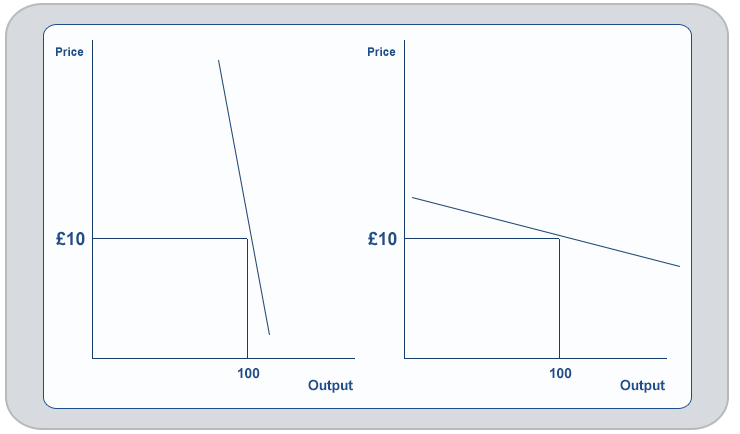
Once it has been ascertained that demand in the left hand diagram is price inelastic (because we are operating below the midpoint) and that in the right hand diagram demand is elastic (because we are above the midpoint) then they can move on to question 2.
Question 1
Which of the diagrams below shows price elastic demand, and which is price inelastic? Why?
Question 2
In each diagram, mark on the same price increase (e.g. up to £12). Shade in and also calculate the new Total Revenue in each case. What happens to Total Revenue in each case?
What conclusions can we draw about pricing decisions?